UX Case Study
Reimagining the Clubhouse Discovery Experience
This new “drop-in audio” app, allows users to host open discussions or hop around and listen in on different conversations. As an active user, I noticed that the spontaneous nature of Clubhouse that made the app so popular was also what made the experience overwhelming to use.
As an independent project, my team wanted to create a feature to give the user greater control over search activities and optimize content discoverability.
Disclaimer: I do not work for Clubhouse, and the views in this case study are strictly my own.
My Role
User Research Journey Mapping Wireframing Screen Flows Visual Design
Team
Timo Wang
Process
Design Sprint
Timeline
Two Weeks
Project Overview
The Brief
Clubhouse gained traction with its high-profile fanbase, in a short time, it has already garnered over 10 million weekly active users and earned a valuation of over $1 billion. Think of Clubhouse as a combination of live podcasts, Twitter, and party line. It openly lets people gather to either discuss or listen in on different conversations, often hosted and moderated by an expert or group of experts in the field. However, unlike a podcast, the conversations are ephemeral – once it’s over, the room is closed, and the conversation is gone forever. Personally, I found the experience of connecting with fresh faces outside of my inner circle to have spontaneous and unfiltered conversations was refreshingly human and interpersonal – just what we needed coming out of 2020. However, I noticed the spontaneous nature of Clubhouses made the experience overwhelming. I kept asking myself:
How does a Clubhouse user expect to form a meaningful connection with their potential community when they cannot locate them?
Purpose
For a user, basic understanding of the algorithm and correlation between their behaviors and the apps’ suggested content is essential to their experience. As the app continues to rapidly scale, the fragmented search features make finding quality rooms a time-consuming task.
Redesign Goals
1
Provide users with more context before committing to join a room
2
Give users more control over their experience within the context of their lifestyles
3
A universal search that organizes content and increases discoverability
Our Team and Process
In February 2021, I met fellow designer Timo Wang in an online UX group. We bonded over our shared sentiment on the Clubhouse interface and opportunities. We decided to make this a personal project and organize a design sprint to quickly and efficiently tackle the problems we were seeing. Due to COVID, we had to do things a bit differently. Working remotely, we relied on Zoom calls, Google Docs and a Figma board to work in real time. Following the design sprint process from start to finish, Timo and I worked alongside each other, both completing each of the steps independently. Then we would regroup to share ideas and findings, using our own skillsets and experiences to refine the finished product.
Our process started with a simple question – how does a user find value on Clubhouse? We wanted to get a clear picture of how users are navigating Clubhouse to better understand their behaviors and motivations. Here are some research methods we used for the redesign:
App Store Reviews
The iOS app store currently has over 415K user reviews and is a goldmine of information that helped us identify and confirm the opportunities and pain points we were experiencing as users.
Interviewing the Users
We interviewed a combination of eight novice and daily users over Zoom – all with varied backgrounds, interests, ages, and reasons for joining CH. After doing our research and examining the data, we identified five common themes.
Research Insights
- Not understanding Clubhouses’ algorithm, new users are haphazardly following interests, groups, and people, which leads to a cluttered hallway with irrelevant room suggestions.
- It can be overwhelming trying to gain context of the conversation when entering a live room.
- The influx of Clubhouse phone notifications can be annoying, excessive, and irrelevant.
- Users are discovering people and groups to follow by going down the rabbithole from a user’s bio.
- Without a way to quickly eyeball a “verified” user, it’s hard to determine user and room credibility.
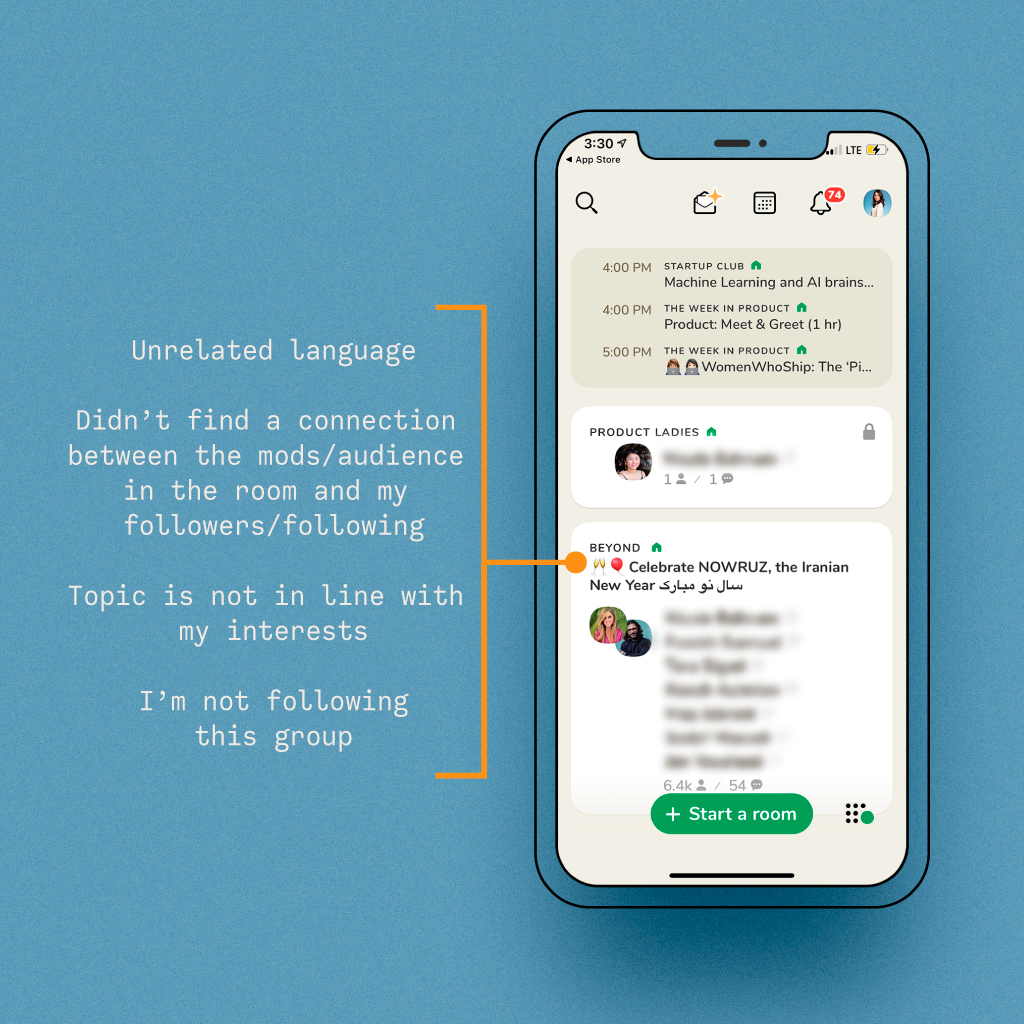
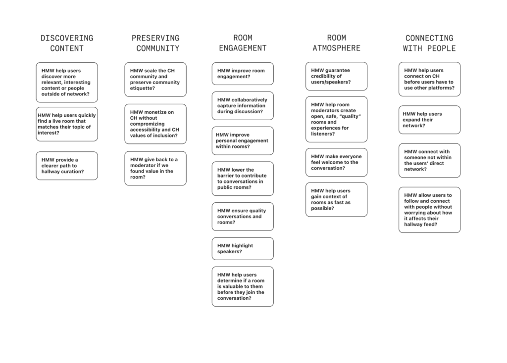
Based on the data we gathered, we were able to organize our observations and categorize them using an affinity map to aid us in determining the best direction to take our design strategy. This exercise allowed us to expose the pain points and areas for improvement – helping us set the stage for the structure of the design process.
User Themes
The Clubhouse User Journey
Taking the information from the affinity mapping exercise we created our user journey map. This exercise served as a guide as we talked through our ideas. Six user map designs later and we finally landed on a flow where three design challenges emerged:
HMW
help users gain context of rooms as fast as possible?
HMW
help users discover more relevant, interesting content or people?
HMW
help users quickly evaluate a room/conversation’s value?
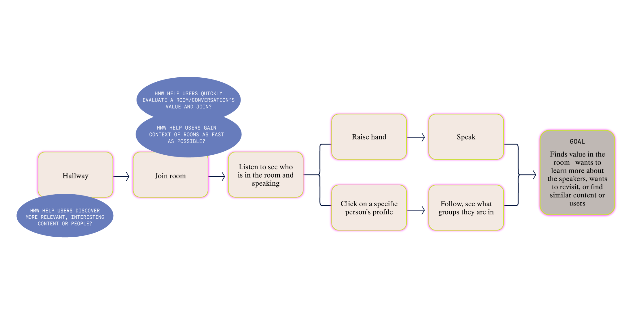
We identified a crucial point at the beginning of the user flow, with the potential to either make or break the user’s experience. If broken, there is a possibility of the user losing interest or getting overwhelmed. We decided to focus on providing the user more control over their search activities and discoverability through interest filtering and a room preview, so users can find the content that they need.
Putting it down on paper
Once we gained understanding of the user flows, we independently set out to sketch our design solutions that could be applied for these three challenges. After countless sketches with various possibilities, we each landed on two separate ideas, four in total.
Tiffany’s Sketches
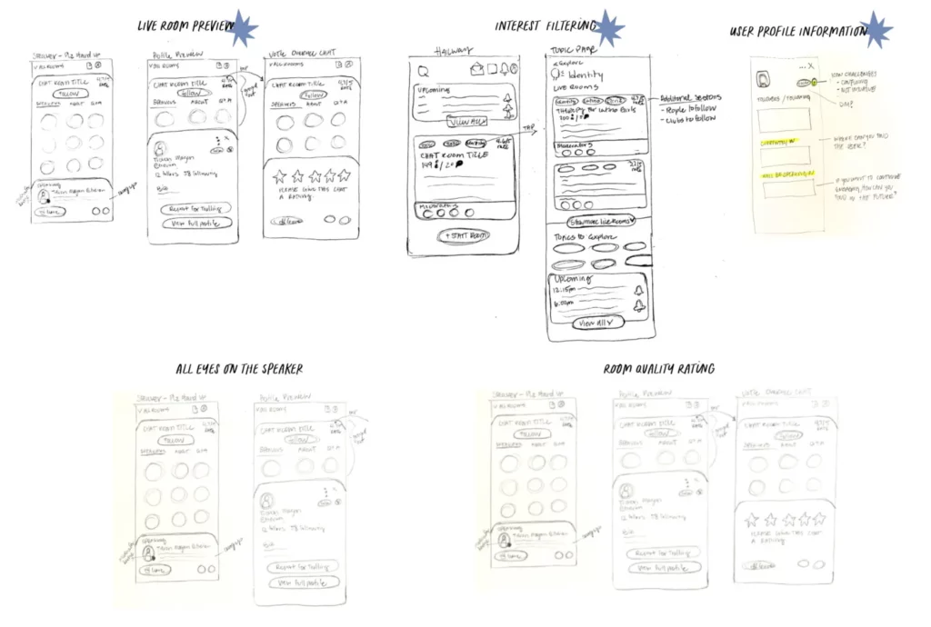
Get a full room preview before making the decision to join – starting with the Hallway. Users will see a chat quality rating (generated by the users currently in the chat) to, discussion description and moderator preview. Once the user shows interest, the second screen will give the user the full room details. Users have the option to also preview the live conversation before joining.
Filter and organize all content by topics to increase user discoverability. Along with what’s currently in the topic pages, additional sections would be live chats and upcoming chats to allow for users to engage with topics.
Include additional information on a user’s profile to show community engagement and aid followers in discoverability and engagement.
Timo’s Sketches
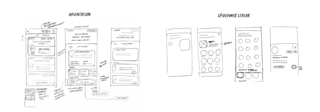
Give users an idea of what they are getting into. Prime users with a short intro/orientation before they hop into conversations so they know the room topic and etiquette and moderators don’t need to worry about resetting the room. Also has a preview of the content of the conversation to help users decide if the room is valuable to them before they commit to joining.
Increase valuable connections through related conversations, events, people, or groups: show related content and resources at the bottom to help users find more topics like this.
Users have the option on their profiles to display the upcoming rooms they are attending or rooms they have recently been in.
Storyboarding Solutions
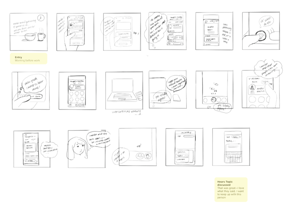
We evaluated the ideas and worked together to combine and narrow the solutions for our storyboards. Although we pinpointed the moment of friction as being when the user first launches the app, for our storyboards we focused on three key moments:
1
Filtering and selecting a room to join from the hallway
2
Room/discussion context to determine value before joining
3
Information on user profiles to aid in community engagement
For the hallway design, I explored various solutions to group the filter functionality. My goal was for users to focus on quickly finding valuable content rather than on learning a new feature. I achieved this by taking inspiration from existing mental models from widely used apps like Airbnb, Facebook, and Yelp that use a filtering system.
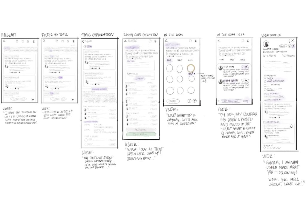
We divided the prototype build based on the parts of the solution sketches we created. While we both had a variation of a preview page, Timo wanted to take it on and build the prototype so it would include her Topic Card feature.
I prototyped the Interest Filtering & User Profile Information features and Timo created the Room Orientation, Topic Card, and Eavesdrop features. For the first iteration, we built two different prototypes but decided to not combine them so we could separately test what features would be valuable and resonate the most then regroup.
My Prototypes
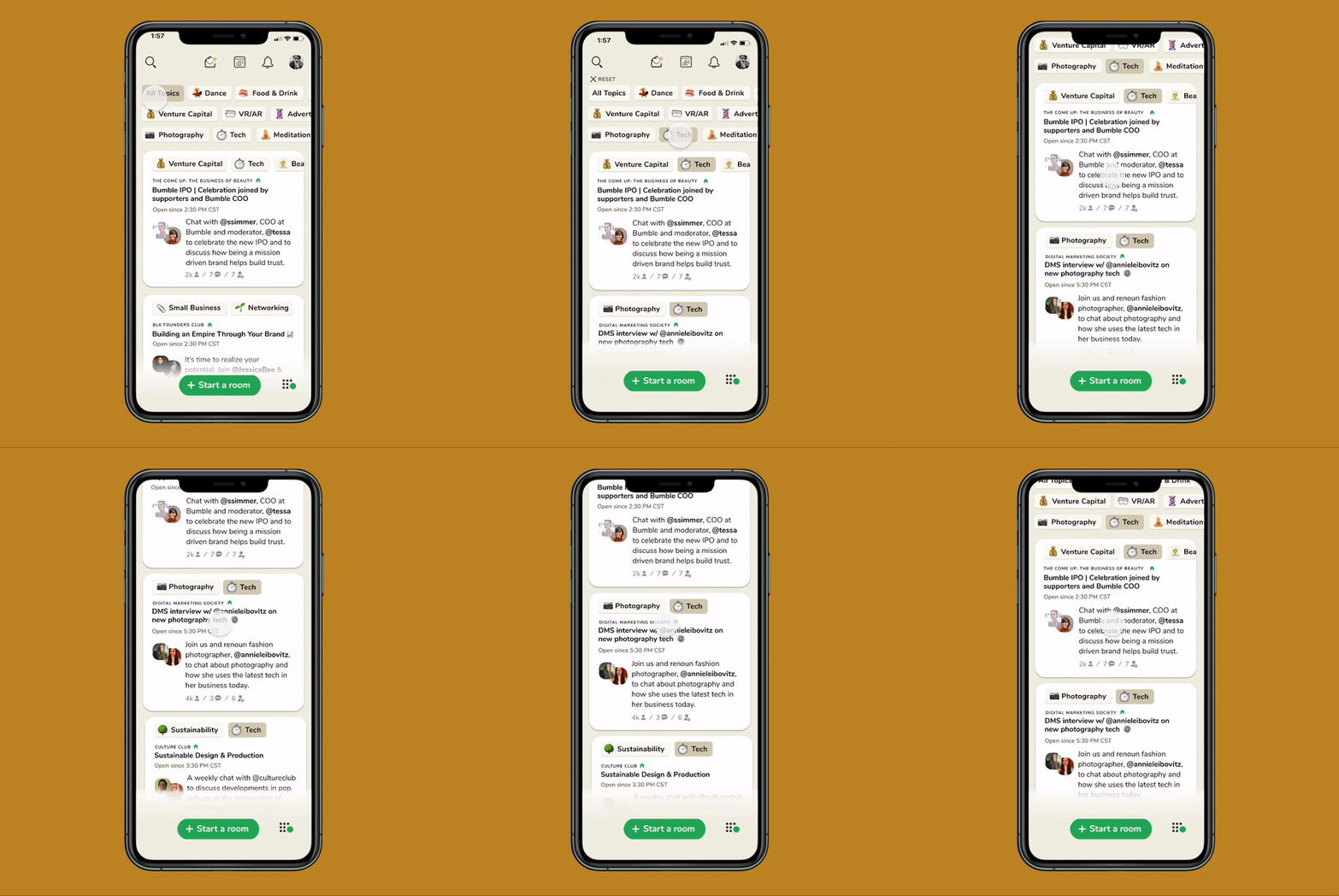
Interest filtering within the hallway allows users to quickly find the live rooms that fit their ever-changing schedules and desired interests.
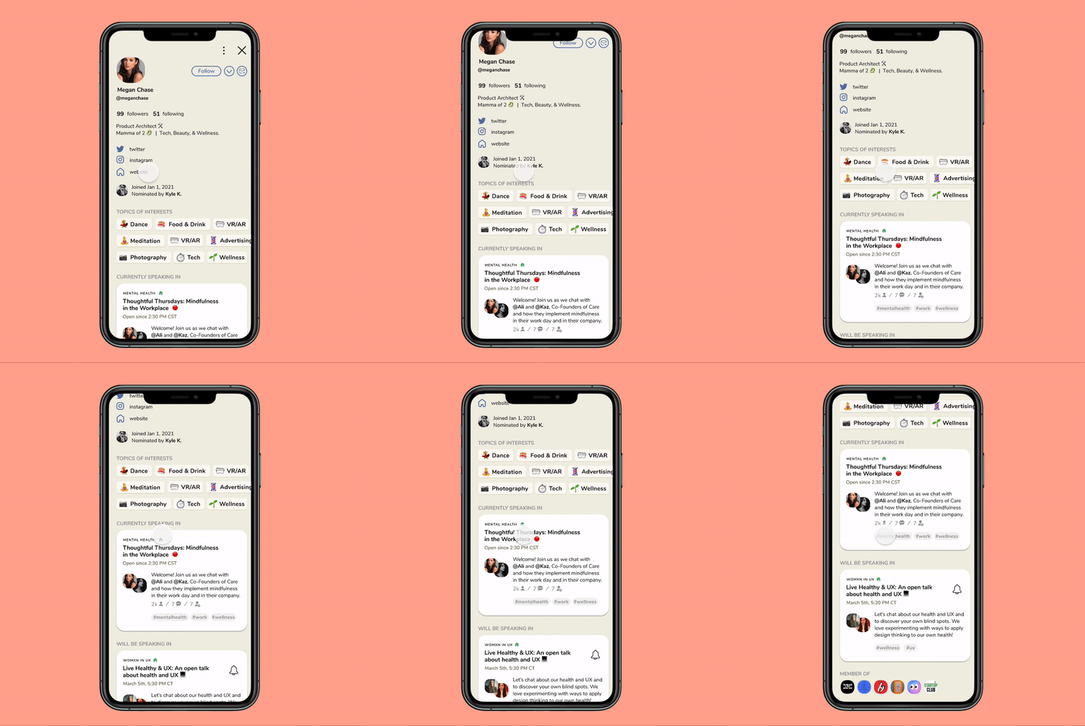
User profile information that highlights their activity and interests on Clubhouse will drive user discoverability beyond their followers.
We individually identified 5 target users each, led recruitment and scheduling, and assembled a research script to ensure we got high-quality and unbiased feedback about the effectiveness, marketability, and usability of the new features.
Interest Filtering Results
- 5/5 of the users I interviewed felt that the interest filtering allowed them to quickly find content that is relevant to them.
- Feedback: However, 2 users pointed out that the use of the emojis was overwhelming.
- Opportunity: Take UI into consideration and clean the area to avoid the user feeling overwhelmed.

User Profile Information Results
- 5/5 of the users I interviewed loved the user profile update with the “Currently Speaking In” and “Will be Speaking In” cards because it opens up a chain-link of information.
- Feedback: Adding the user’s interests on their profile would not be something users would find of value to determine if they would follow.
- Opportunity: Rethinking through the user flow and mindset, we felt that publically showcasing the user interests was not relevant to help a user decide to follow or not. We removed it altogether.

After reviewing our findings, we decided to consolidate our ideas, combine our prototypes, and go for a second iteration. Below are the iteration decisions we made for each feature.
Tiffany’s Features
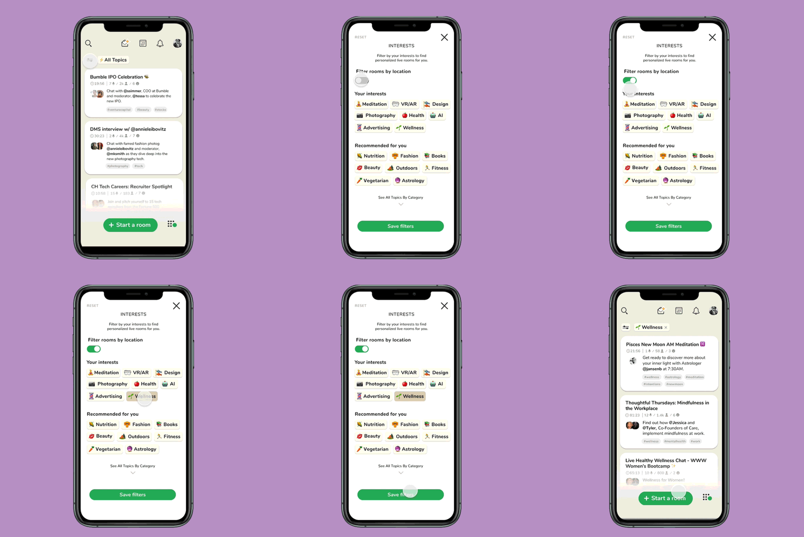
Topic Filtering
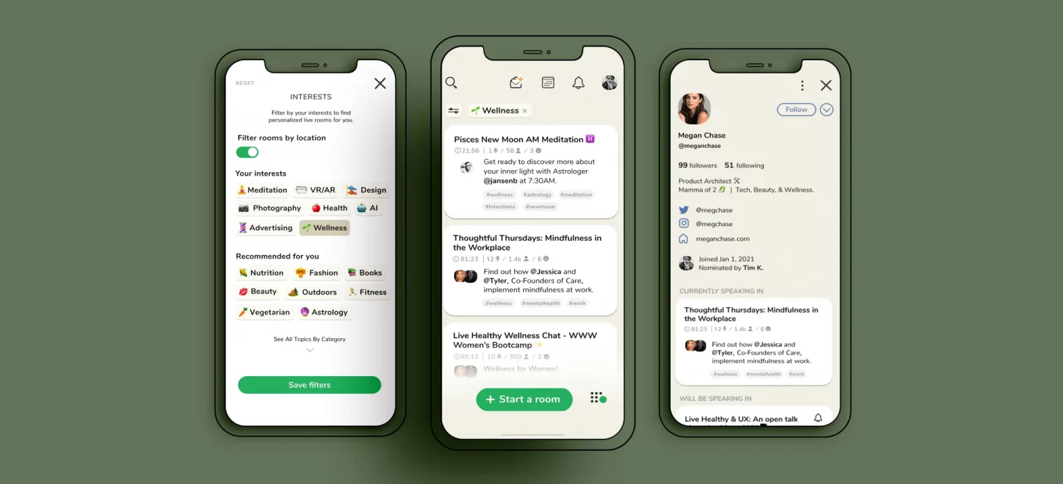
- Simplified the hallway navigation by swapping out the “more topics” to a simple button with a universal filter icon.
- Created a “Filter room by location” option for users to connect with groups within their area.
- Organized the filter categories into three relevant sections – “Your Interests”, “Recommended for You” and “See All Topics” to guide the user.
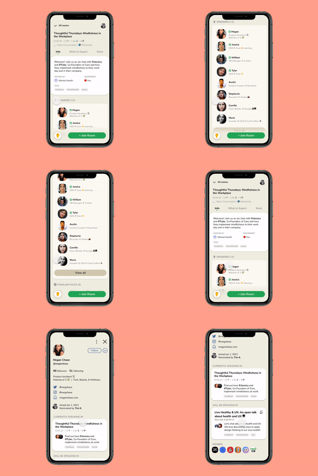
Community Engagement Information
- To streamline communication within Clubhouse, we added a DM option for direct user communication.
- Added a website link option to the existing Instagram and Twitter links to create a more direct CTA path.
- Simplified UI and removed users’ interests section.
Timo’s Features
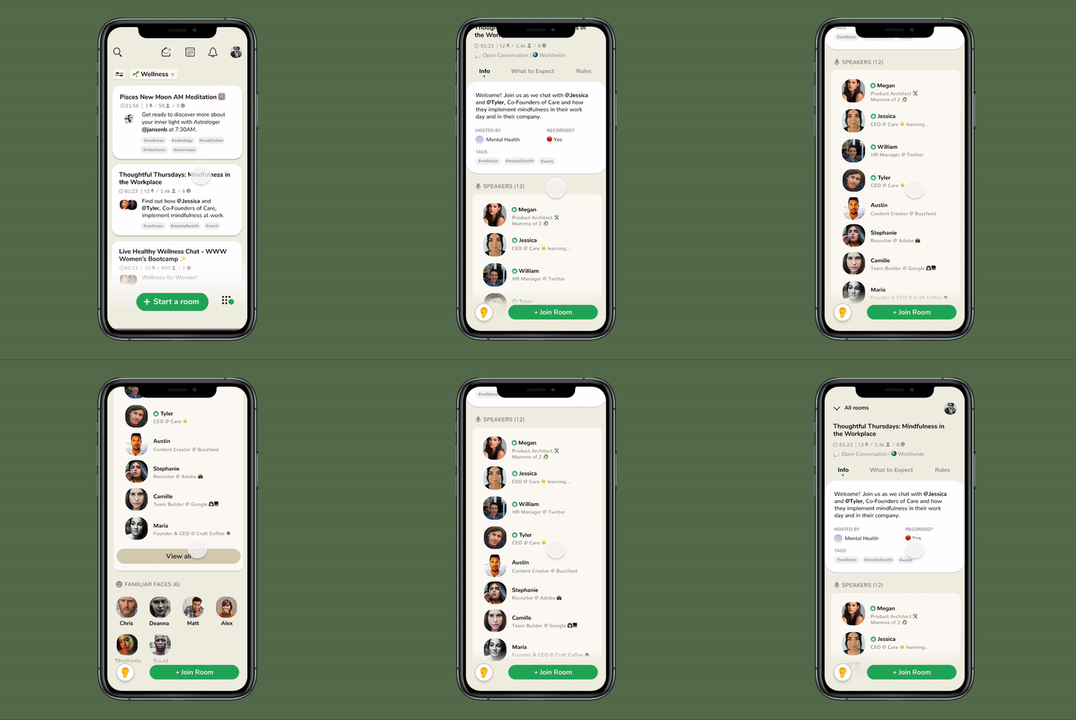
Orientation & Topic Cards
- Reorganized the information and focused on the most important information for the users to make a decision on whether they want to commit to joining.
- Minimized user discord and swapped out obscure icons with more familiar ones.
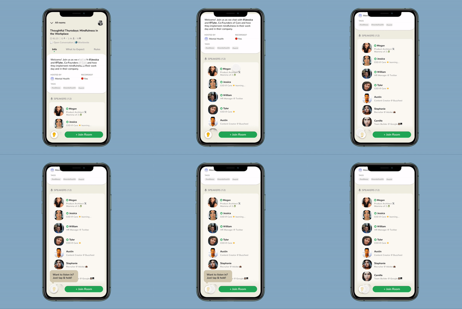
Eavesdrop
- The eavesdrop feature would only allow the live room audio preview to be for about 7 seconds—just enough for users to gain context to the room.*
*Privacy is a major concern and something the Clubhouse team is actively trying to solve. Although it is possible that users may record the conversation anonymously, we decided that the majority of positive feedback from the rest of the users still makes a strong case for this feature.
Final Prototype
Key Learnings
- Participants saw the value in content filtering to quickly and efficiently find quality content and improve discoverability, which created a positive sentiment with the CH experience, likely resulting in increased time spent on app and WOM marketing with their peers.
- Participants appreciated the orientation screen and eavesdrop feature. They unanimously felt that it would lead to a more intentional experience in the room consideration phase.
- Participants were excited about the updated user bio and made comments about how it would dramatically improve how they determine user credibility and discover other users and content outside of their immediate connections. This opens up opportunities for authentic and quality business partnerships, collaborations, sponsorships, investments, connections, and hiring.
Conclusion
We believe that our concepts will improve the current user experience to allow for quick searching capabilities for users that are time-constrained, as well as set the stage for monetization efforts and discoverability as the user base continues to rapidly scale.
As places continue to open up more widely, Clubhouse will be faced with scaling and innovation challenges as users go back to their brunch with friends or opt to attend IRL events rather than sitting at home on the app. My plan is to continue to monitor the cultural trends and Clubhouse platform, and adjust these solutions as a new sense of normalcy is defined.
Overall, it was an absolute joy partnering with Timo and utilizing each of own super powers and experiences to actively communicate and come to solutions to ensure the project’s success.

